Selling wine is as much about presentation as it is the taste of the actual elixir. After all, if a bottle doesn’t look good, then who’s going to buy it?
A whole book on proper menu design could be written that’s specific to wine lists, and needless to say that inventory arrangements, fonts, graphics, spacing, types of paper, menu backings and all other stylistic concerns do in fact matter when it comes to influencing patrons to buy one bottle versus another, or to convince them to buy a bottle in the first place over going by the glass (BTG).
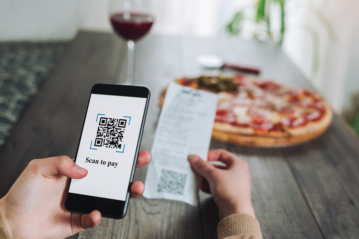
The pandemic has thrown a wrench in this process as many customers now expect menus to be accessible on their phones via a QR code. The benefit for the restaurant is certainly there in the form of saving on printing costs, but it’s nonetheless a tradeoff.
Paper is palpable. You feel the slight roughness of a thick paper stock, subtly smell the ink, are delighted by the way the room’s lighting creates soft shadows on the page and are soothed by (what we ideally hope that you would use for your establishment) the touch of the leather menu backing on the palm of your hand.
Viewing a wine list on your phone gives you none of that. Yes, you get graphics, color and the ability to keep the webpage updated in real-time as inventory changes, but everything beyond the straight visuals are lost in the endless scroll of a two-dimensional screen.
And building on this notion of scrolling, one critical difference is that a physical list – or even a binder in the case for some restaurants with an expansive cellar – presents all bottles together for readers to consider, whereas a responsive webpage (over simply displaying a PDF version of the menu) will usually configure all items into a single column so as to keep everything legible and to avoid lots of pinching.
The problem here is one of perception, where a narrowly focused column on one’s phone can increase the observed length of the wine list, resulting in patrons ‘dropping off’ before perusing the entirety of it. Hence, if you’re hoping for guests to land on those top-shelf vintages at the end of your list, forget about it as they’ll barely make it through the BTG offerings.
While psychological issue of physical versus digital menu is one that will continue to evolve as the tail end of the pandemic plays out, one consideration for the here and now is to bifurcate the BTG from the full list of vintages by the bottle. Then it comes down to knowing your customer.
When two friends plunk down at the bar and don’t order any food, chances are they’ll be vastly more inclined to go BTG, have a pint or ring up a cocktail than to split a full bottle. On the other hand, a couple that’s looking for a proper three-course dinner will stand a far better chance of wanting to complement that special occasion meal will a great bottle of wine to elevate the experience.
For this latter cohort, presenting the optionality is perfectly acceptable through questions like, “Wine by the glass is available via the regular beverage menu accessible by scanning the QR code at your table, but would you want me to bring over the full wine list for you to select a bottle?” Have a rough idea of how your customer is thinking and that’s how you’ll maximize wine sales.
